A
(Ruled out)
Patch the worst pages
Low risk, no retraining — and no ceiling raised. The problems were architectural; this is polishing rooms in a house with a broken floor plan.
Fixes symptoms, not the plan.
02 — Sugar CRM · 2024–25
(5 min read) · (Shipped)
Sugar CRM is where every VBG employee spends the working day. Years of growth without a designer had buried the work four to six clicks deep, and claim submissions had quietly fallen by half. I rebuilt the information architecture — and let five teams decide what it should be.
(Context)
(Owned)
IA redesign · Research & card sorting · New sitemap · Page-layout logic · Rollout plan
(Partnered on)
Engineering build · Role permissions — companion case
(Constraint)
SugarCRM let us restructure navigation, pages, and fields — not the record model.
Interviews and field studies with each role surfaced three structural problems:
1
One navigation for everyone. Crowded with links most roles never used; no secondary navigation; the same features in different places on different pages.
2
Everything was deep. Key information sat 3–5 clicks away; related content was scattered; critical actions like upload had no consistent home.
3
Key details hidden in plain sight. Pages omitted basics like file names or the associated veteran; sorting followed no logic users recognized.
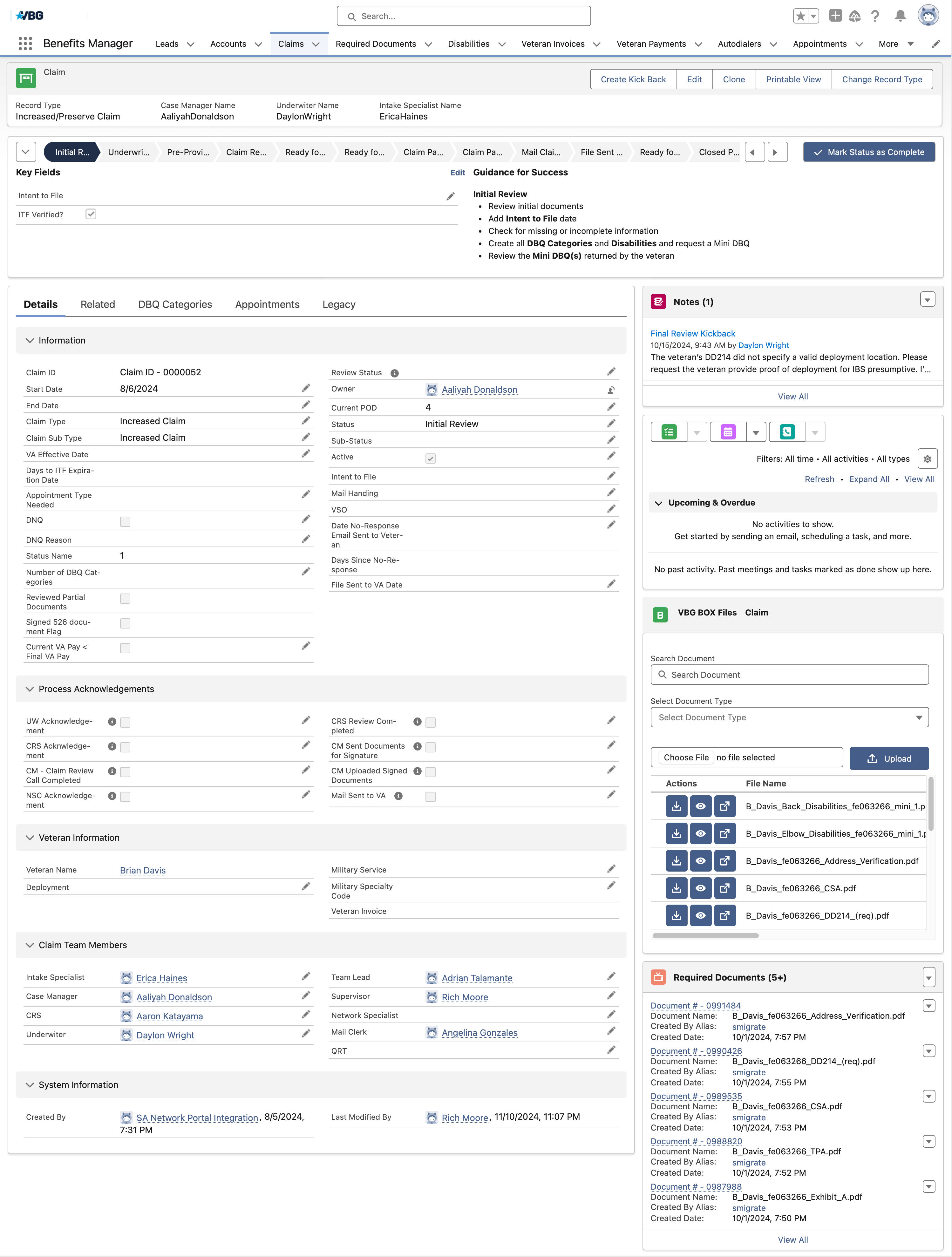
Twelve top-level menus, a thirteen-stage status bar, and four tabs of fields, the density that pushed everyday work four to six clicks deep.
Home
Dashboard for all roles
Leads
List view
Accounts
List view
Claims
List view
Documents
List view
Disabilities
List view
Lead View
Account View
Claim View
Document View
Disability View
Notes
Notes
Notes
DBQ Categories
DBQ Category View
Documents
Documents
Documents
Documents
Disability History
Document View
Document View
Document View
Notes
Documents → DBQ Categories
(Strategy)
A new IA from heuristics would have taken a week, the problems were that visible. But five teams would have to relearn the tool they use eight hours a day, and a designer’s opinion would not survive that fight. Evidence would. First, the path:
Low risk, no retraining — and no ceiling raised. The problems were architectural; this is polishing rooms in a house with a broken floor plan.
Fixes symptoms, not the plan.
The platform let us rebuild navigation, pages, and fields, but not the record model. Months of work, five teams retrained.
Months of work — and the ceiling comes down.
Floated by ops leadership. But every documented problem was structural, not platform-specific — and a mid-year data migration the business could not afford.
New tool, same rot.
(Process · Redesign)
(Waypoint 01 · Chart the terrain)
Participants from every role sorted each page and feature around their real workflows. The new IA came straight from their mental models and put every key page within two clicks.
Every page, field, and action as a card
Where participants put them
Home
Claims
Documents
Disability
Roles grouped differently, by task type or by frequency, but identity fields (who the veteran is, which claim, what file) landed at the top of every sort.
More
Claim View
Mark as complete
Account View
Edit button
Document View
Accept · reject · edit
Disability View
Reviewed · create diagnosis · upload
Actions in green did not exist before, they were buried in menus or handled outside the system entirely.
What used to sit four to six clicks down now lives on the record itself; nothing important is more than two clicks from the homepage.
(Waypoint 02 · Redraw the main roads)
Navigation keeps only the most used links; the homepage now leads with work progress, key updates, and each role's top pages. The day starts there, not three menus deep.
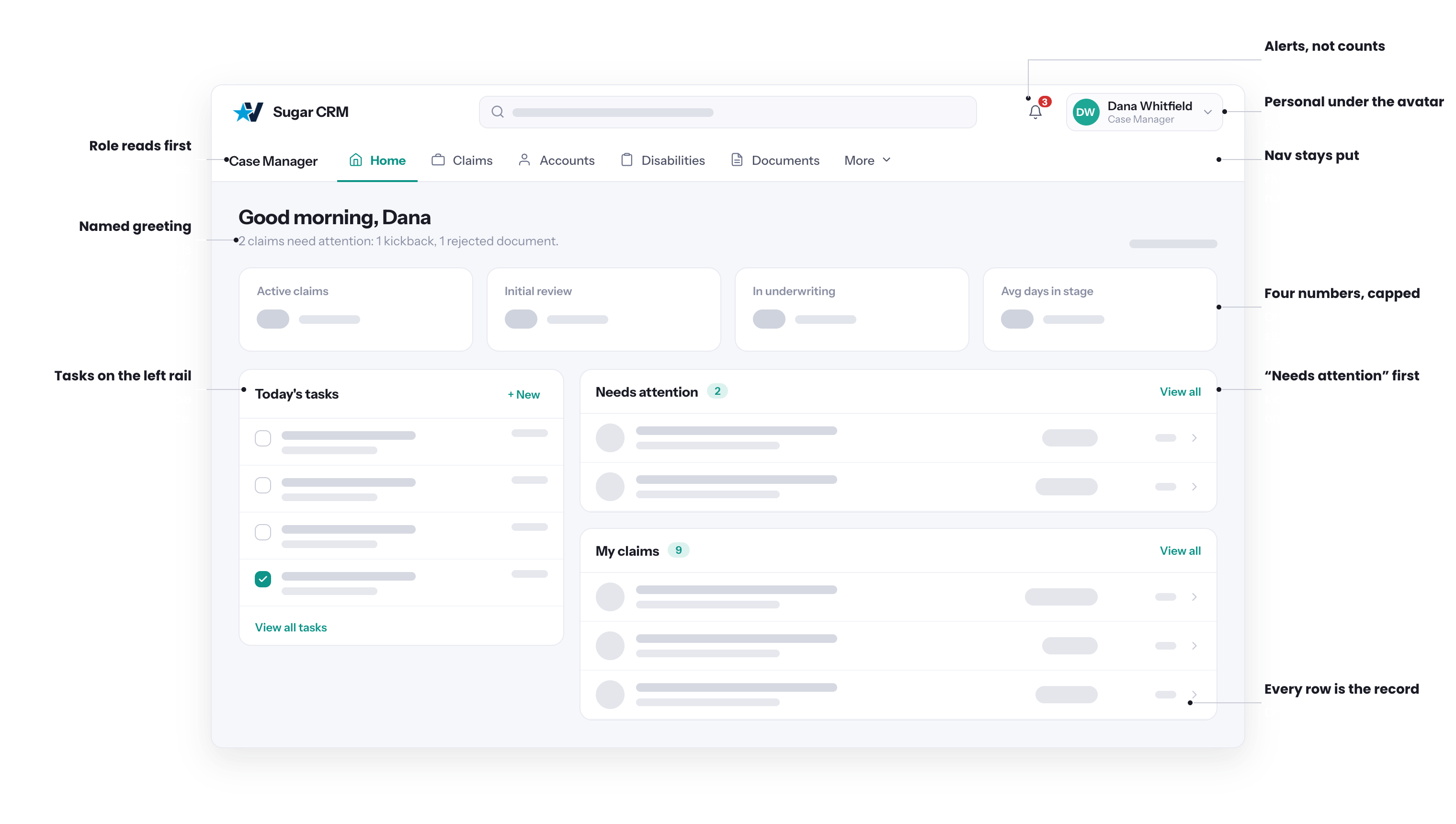
(Waypoint 03 · Fit each room to its use)
One rule settled every page debate: pages people act on get cards with key info on the face; pages people scan keep tables, plus the identity columns every sort demanded. Deciding the rule first meant no layout ever got relitigated.
(Impact · Outcome)
2×
claim submissions within one month of launch
−28.6%
navigation errors after the restructure
1.8 → 3.1
satisfaction score (of 5), with users citing easier navigation and faster access to key information
(Reflection)
When several roles share one system, the IA is the product. The deeper lesson was authority: I could not argue five teams into a new structure, but I could hand them the cards and let them argue each other into it. The card sort was not just research — it was the political strategy.
(Next case study)
Four Roles, One System →